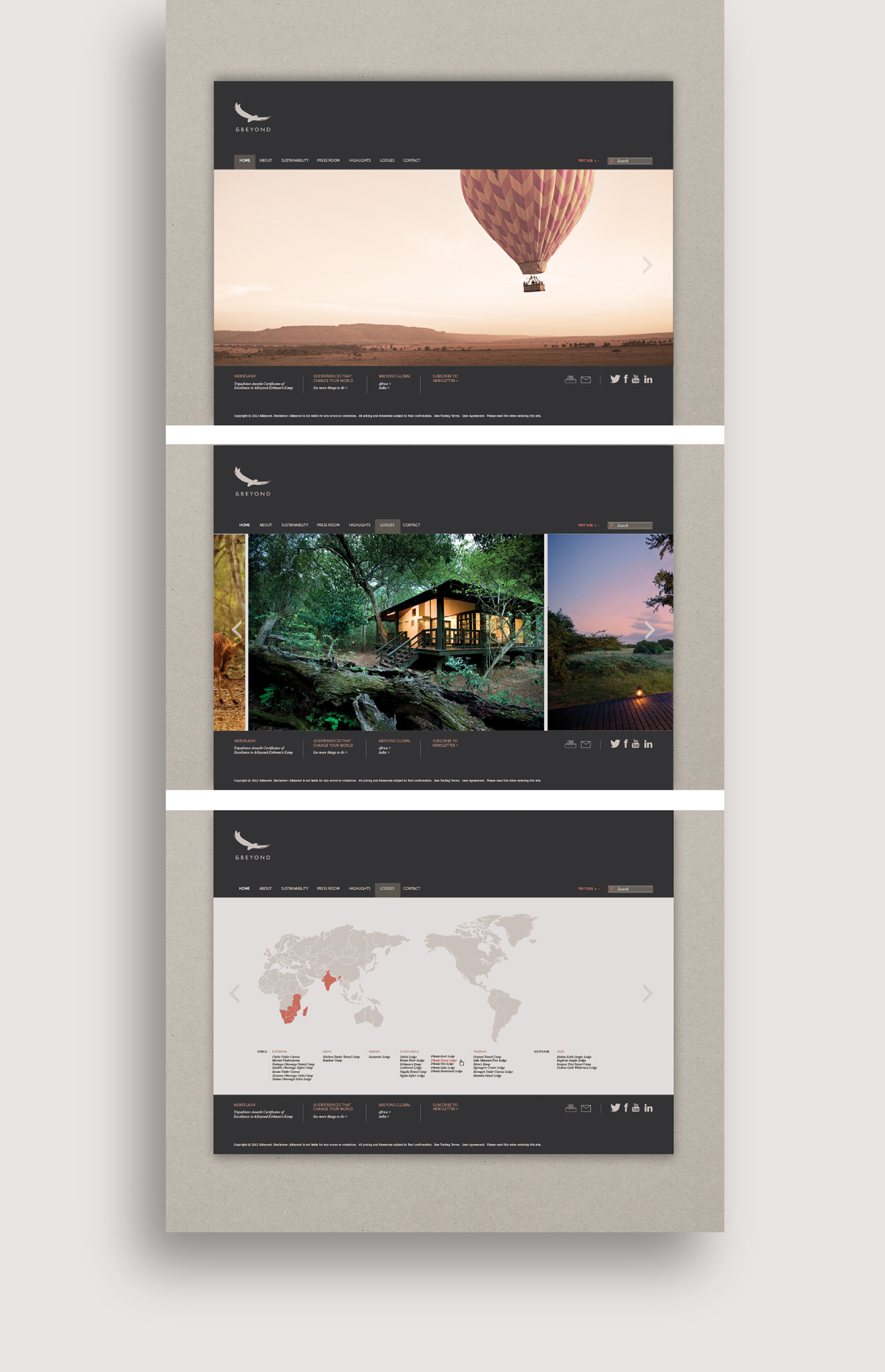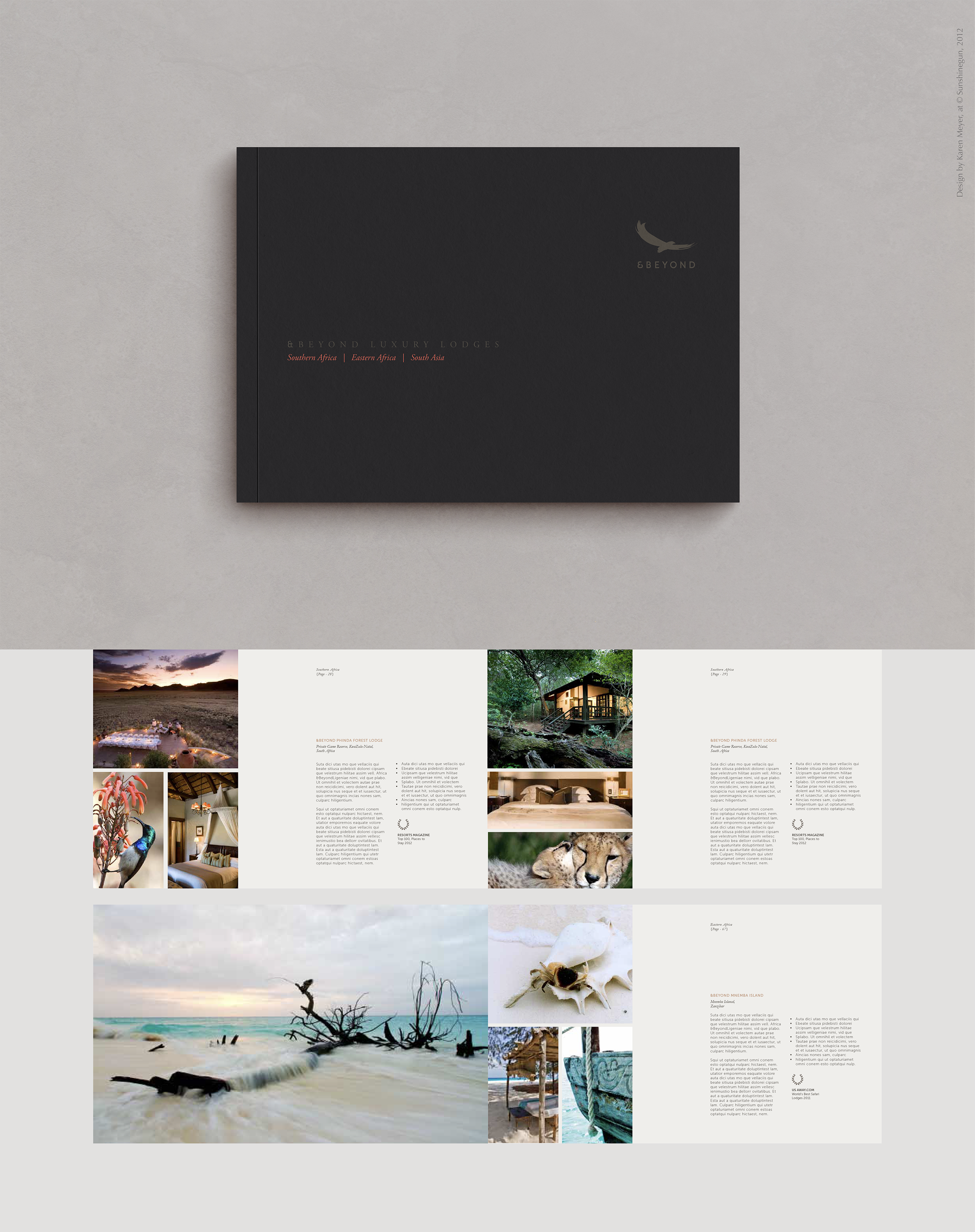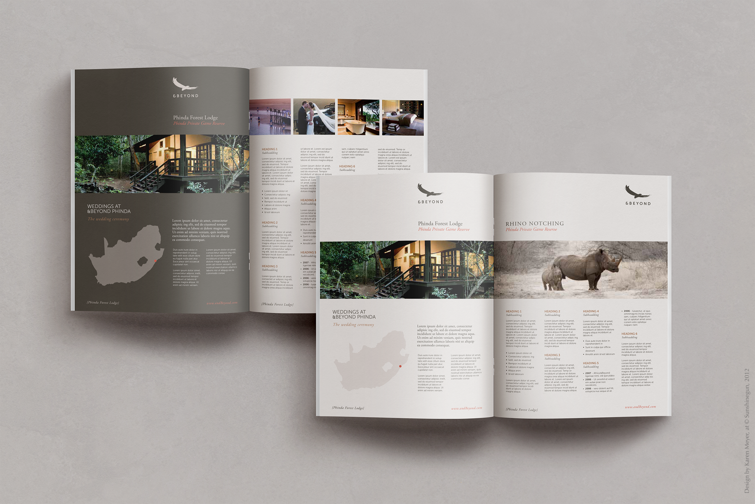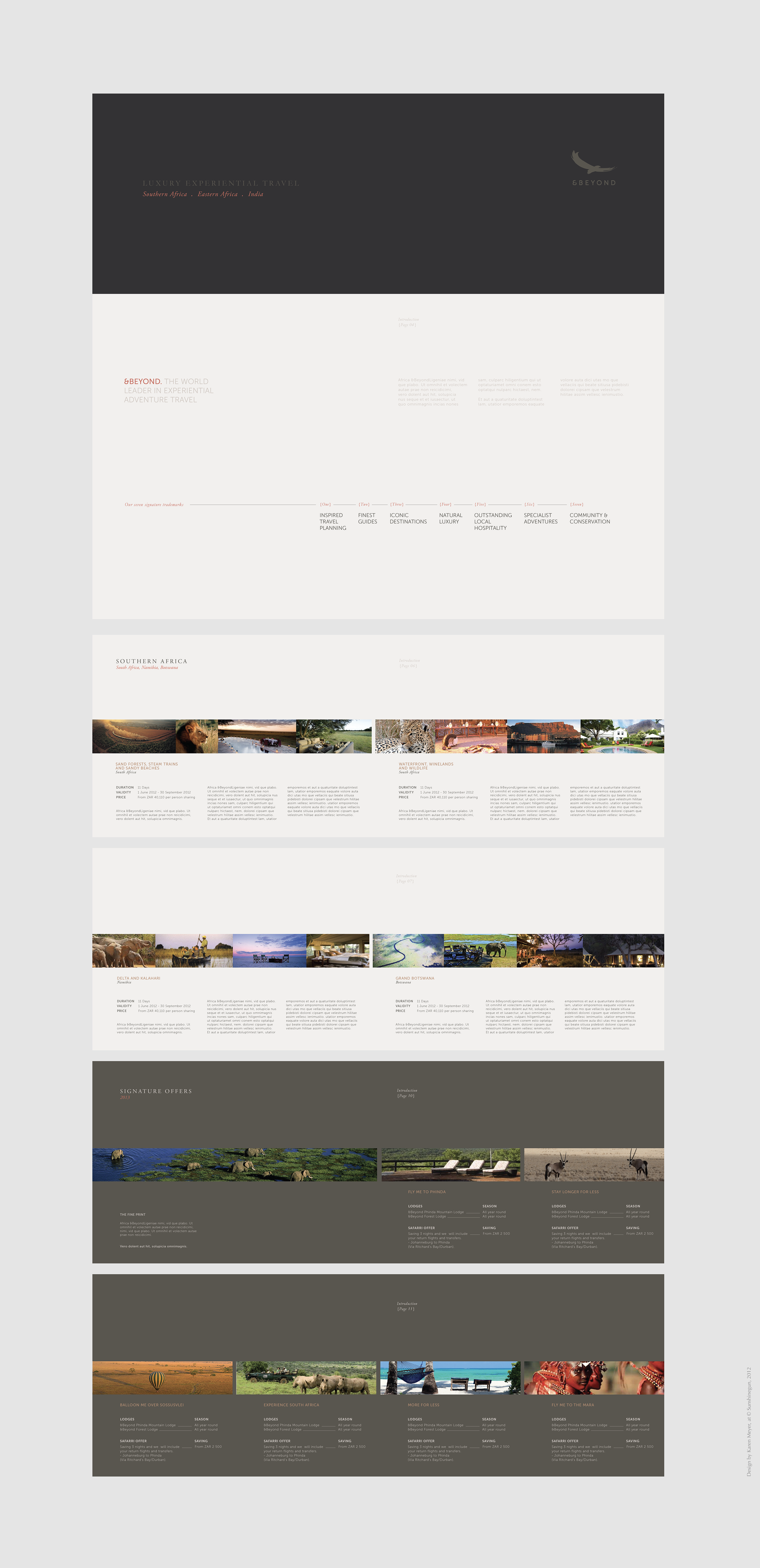
FULL BRAND IDENTITY DESIGN + Print/DIgital Roll-out
&Beyond Luxury Lodges
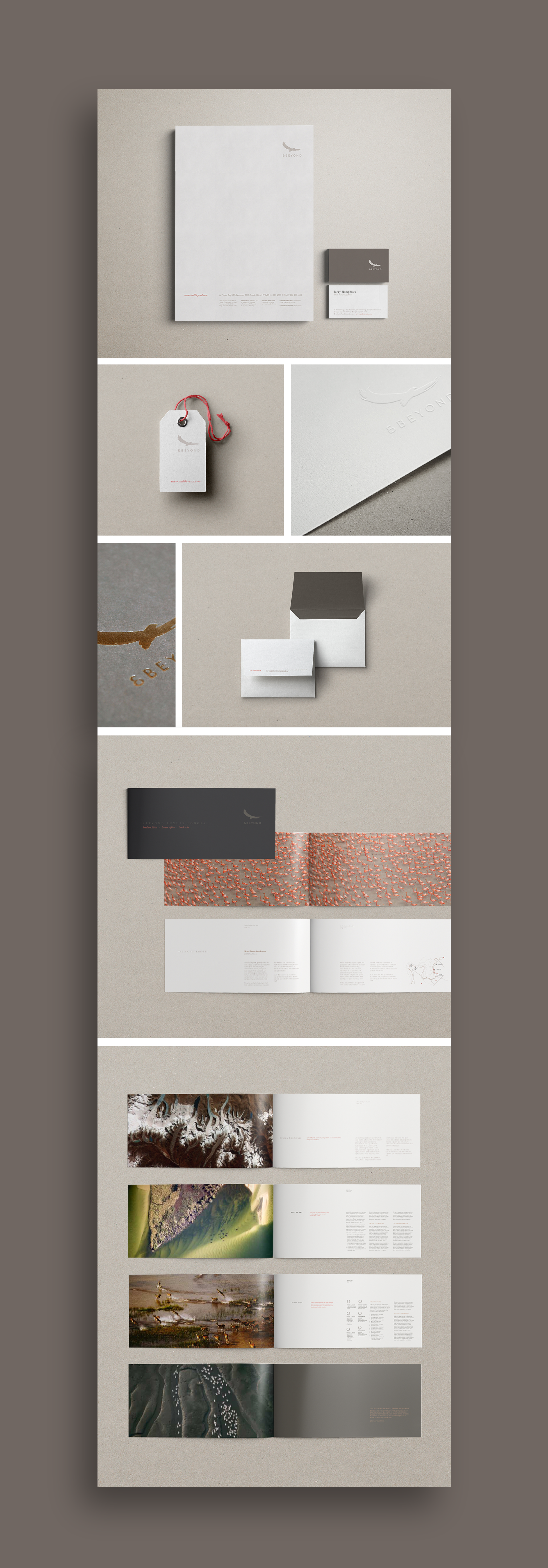
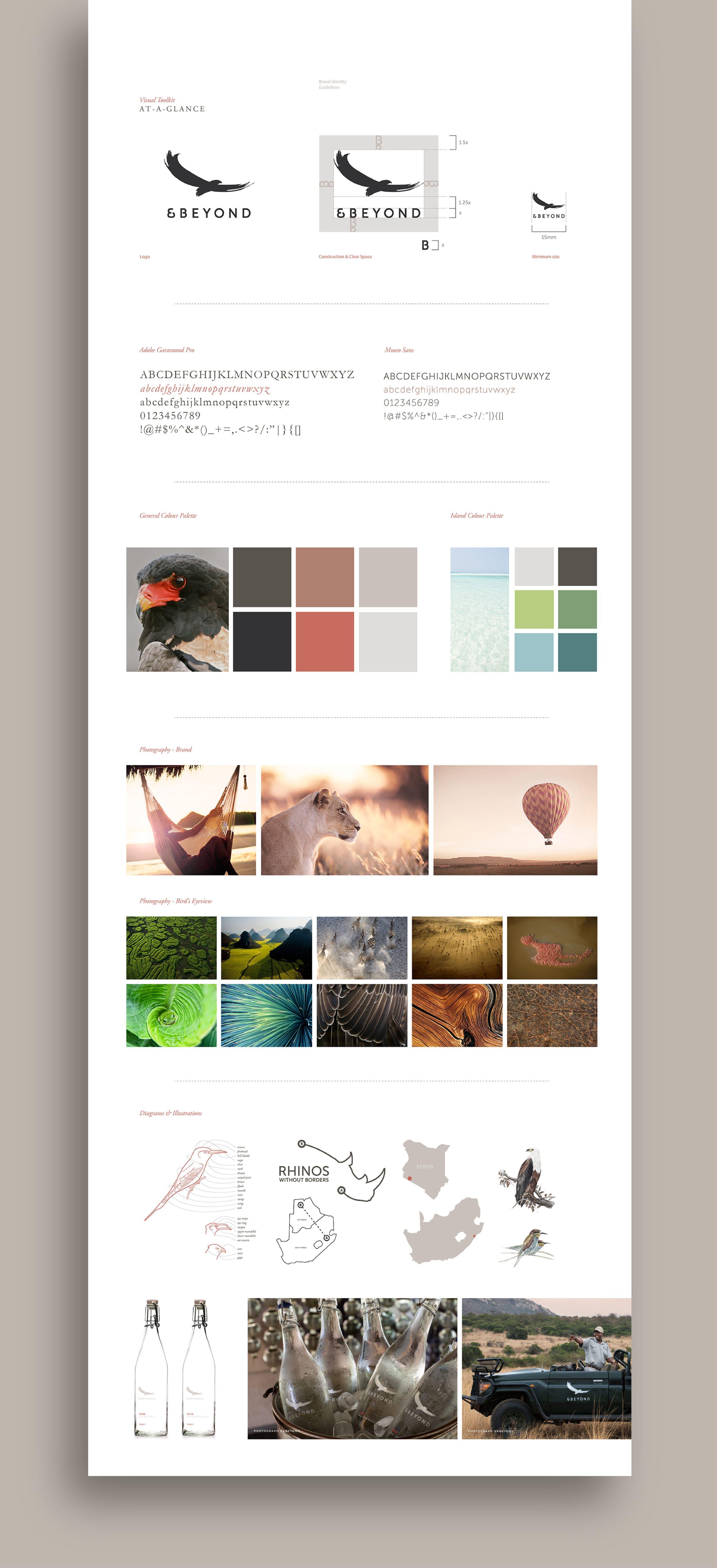
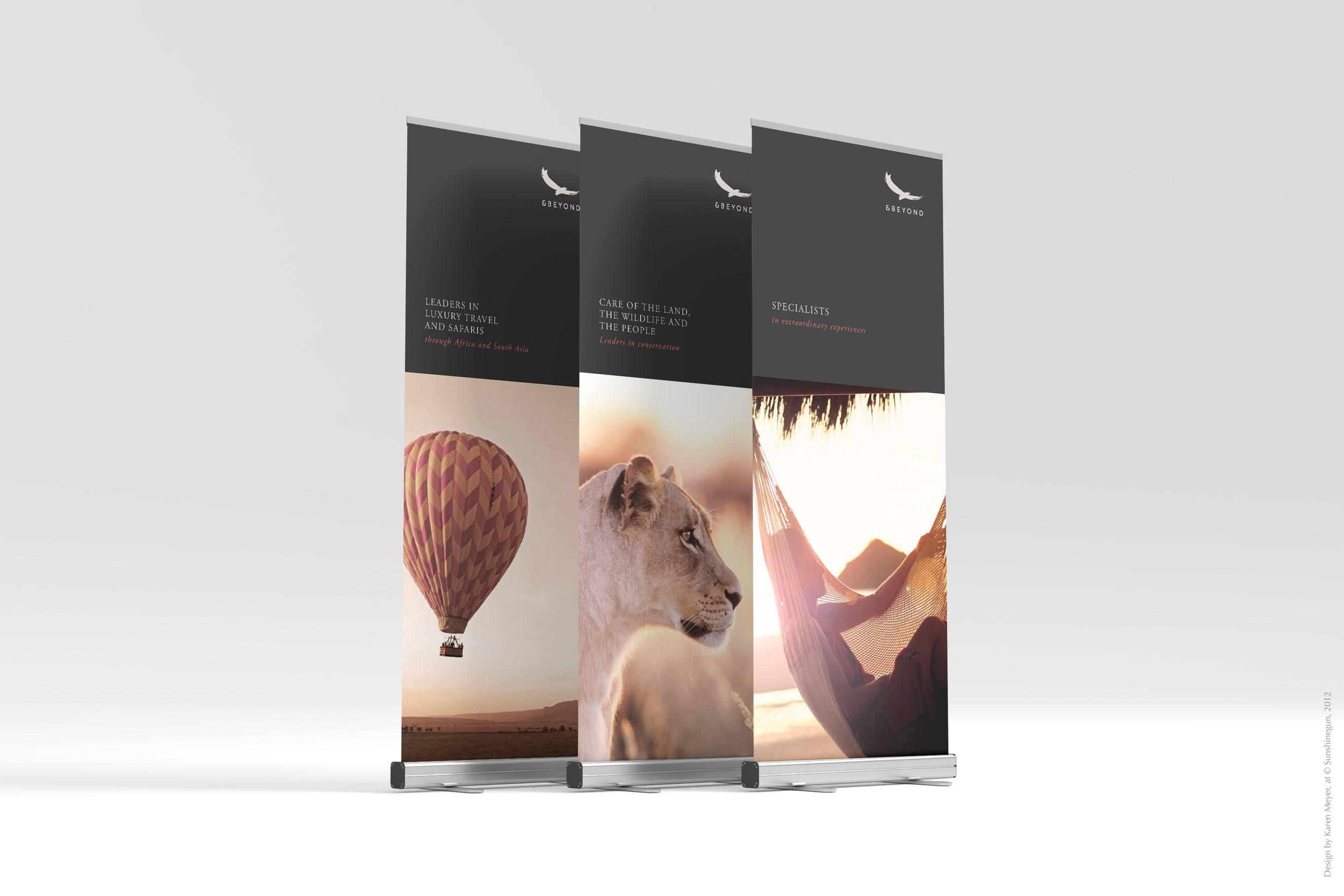
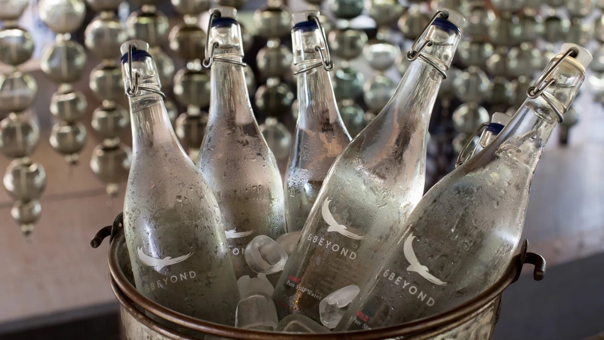
Legend holds that whenever the Bateleur Eagle was seen soaring above a landscape, it was nature’s way of revealing sacred ground — the destined setting for the next andBeyond property. The previous logo was released from its cage and allowed to take flight — rising to higher ground as an entity in its own right. As a local sacred bird, the original hand-painted Bateleur was preserved, while the introduction of a refined complementary typeface and a distinctly crafted ampersand (upon client request) gave grounding to a renewed and elevated identity. Inspired by the rich yet subtle hues of the Bateleur’s physique, the visual style / shapes echo its graceful flight patterns and reflect the vast openness of the landscape. The full brand identity redesign included internal/external collateral across print and digital, including templates for internal use.
Brand Logo + Identity Design
Full Internal / External Roll-out
Editorial Design (Brochures)
Photographic Curation + Basic Photo Grading/Editing
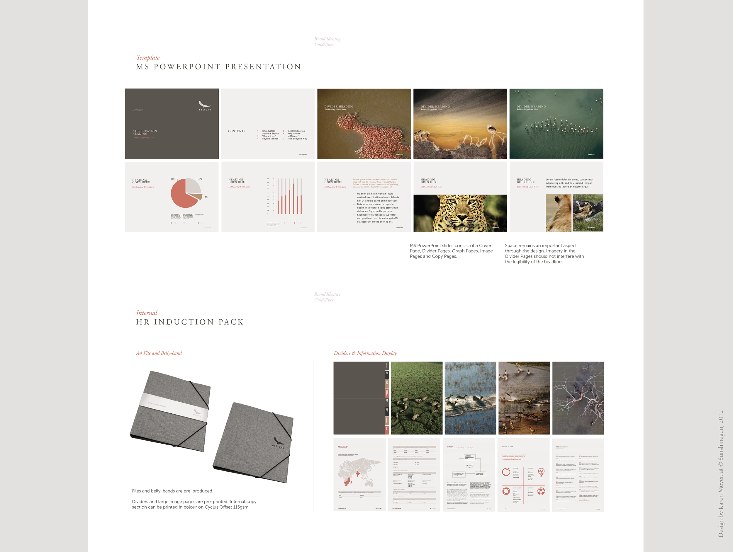
Internal Templates
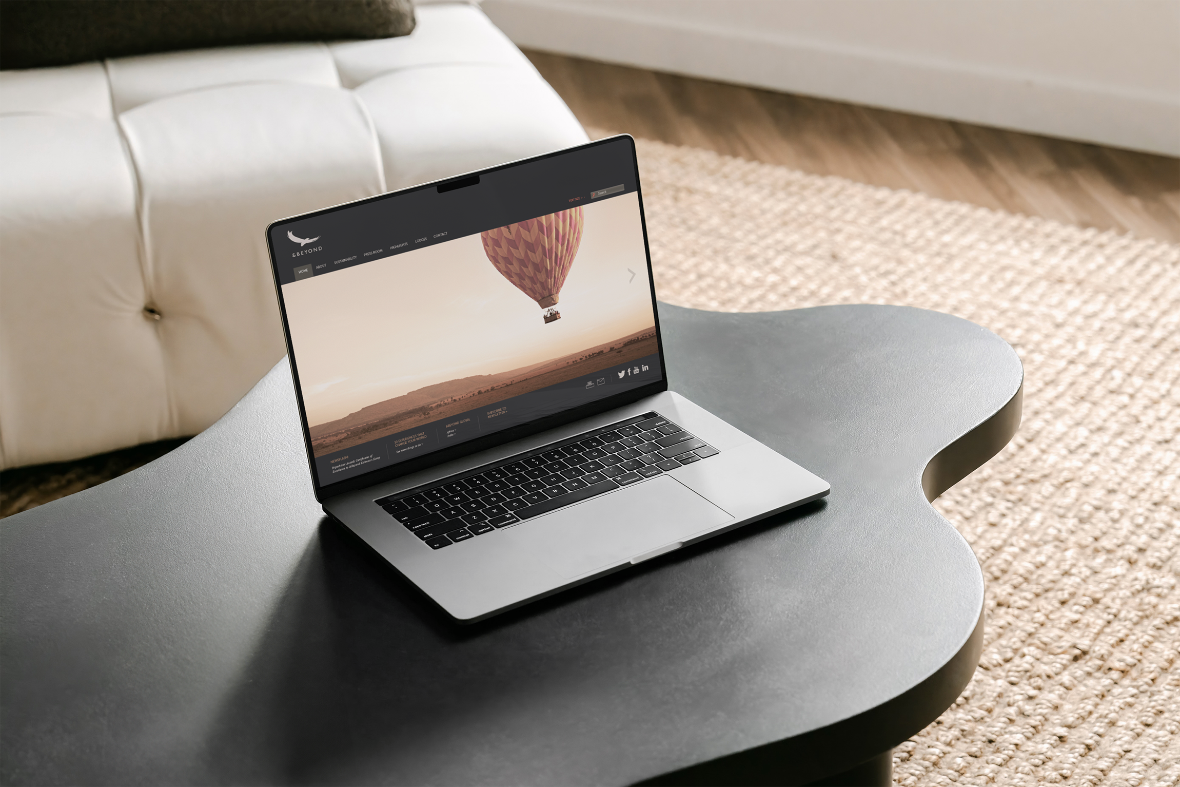
Website Look-&-Feel
Brand Manual
Signage / Expo Stands
*Design by Karen Meyer at Sunshinegun (CD: Bronwen Rautenbach), 2012